Author: sswerwolf

Week 8

Aesthetics of the Extreme

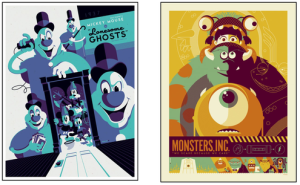
Design with the intention to be in your face. It uses bright colors, colors that clash, are loud, and draw your attention to it. It meant for you to look at it, draws you in, maybe with some wow factor or something really interesting you should look at. It started in the 17th century with the Baroque period, artists started to use colors in new and interesting ways. Artists would bright colors on dark backgrounds to intrigue viewers. Later the style continued where you could see it in the art of the 60s, especially pop art (one of my least favorite art styles) with its use of bright colors, crazy shapes, high contrast.

The extreme aesthetics are still used today, you can see it corporate campaigns, events, and internet videos.

Week 6

Viral Campaigns and Media

Viral campaigns have a little bit of mystery to them. Companies usually like to do them with the intent to get the consumer to do some of the marketing for them to make it cheaper. The viral campaign can be a bit of a risk on its success but its very but it has a high pay off risk/ pay off wise. Viral campaigns can be anything from flash mobs to commercial exploits. A viral campaign can also help to humanize a big corporation because it lets them be more personal with their customers.

Another popular form of viral campaigns is memes. A meme can almost be anything now a days, everything from raptor jesus to courage wolf. A lot of them with have funny captains set in a certain way to go with the picture chosen and usually the captain can be swapped out with a very similar one to say something else similar.

Week 10

The last glorious blog post where I talk about what we learned today in class, woo.

Desire and Design

What is the main three thing people typically want? (money, comfort / safety, sex / desire) A feeling of completion, having that satisfaction of getting what you desire.

The id, as a designer its something you desire and that cannot really be changed. It want what it wants, but you are able to trick the id into thinking it want something else. The id wants what it wants and does not care about any outside distraction. The ego can help trick the id, kind of a compromise. The ego gives the id something else in the place of what the id wants as a substitute that will be jut as good as what the id wanted. The super ego is about not wanting to do certain stuff because its afraid of being caught, exposed, or cast out.

With design we are typically being promised something we want to acquire. It’s about getting this one thing we will be fulfilled and never have a want after the acquisition.  You have to go out and buy something to achieve completion.

Anthropomorphic design, it about imbuing an inanimate object with some human qualities, though it can be a bit of opposite as well where a person interacts with a object they become more machine like. A lot of the time anthropomorphic design is very obvious, though sometimes it isn’t as much.

Desire and Satiation, it’s about having that desire, that thing you really want. Then getting that thing you want and becoming satiated from it, not being full but being satisfied, not stuffed, just content.

We as designer need to really consider peoples desires as we go about our process. Think about what the goal is for other desires.

Week 7

Today we’re talking about apps and the web. Also the interface that goes with them and how they differ. Why would a company want an app over something like a mobile/ responsive site. As I know and mostly argue about myself that an app is typically unnecessary for more companies that want one, it’s all about how much content they have and if they have a login with your user profile. For example the Amazon was a good idea because you can have it always connected to your profile so every time you enter the app it knows it’s you using it. While with the mobile version you’d have to login every time you’d like to purchase or view your wish list. It really is just dependent on whats the justification for having an app over a mobile/ responsive site.

Checking out your site mobile hierarchy. Supposedly you have 5 seconds to get a persons attention with your site. More realistically you need to have your site be able to be learnt very quickly by the user so they feel comfortable with using your site.

Now a days for apps its not so much about being the first to come out with a new original app. It’s more about finding a market and creating a map that does it better than the rest.

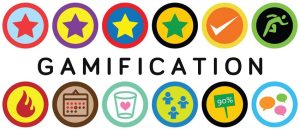
UX (User Experience) good UX helps with conversion on a website, ie. making money. We looking at a Italian bag company called Bagagia to see the parallax feature. It helps create a sense of depth and that kind of “wow” factor to entice consumers. Something similar to the use of parallax is “Gamification”. It’s kind of a silly way that uses incentives / achievements to entice people do something like an activity and collect those achievements for doing whatever activity.

Skeuomorphism_youthedesigner  UX-infographicgamificationBRO_ResponsiveDesign_Main2windowsflat

Week 5

This week we had to present our group projects in front of the class and three industry professionals. Seeing that the industry pros were around my age and from the graphics and web field, it was pretty nice to have them there and their honest critiques.

My groups project was a brand we created for a handheld vacuum, that was supposed to be this eco minded average income 20-30 year old. We decided to call the brand Sol after the sun thinking it was a slightly clever name with the eco minded part in mind. Unfortunately when it came to presentation time one of our group members that I can’t recall his name bailed after two weeks of no communication or work, and one of our other members that was responsible for the competitive analysis wasn’t able to make it either, so it was just the three of us. Due to that we didn’t know each others parts perfectly and it showed during our presentation. I know Tony later after the presentations mentioned how important it was to know every persons job in case of a event like that it’d make it very easy to fill in and talk on their part.

During the actual critique and listening to the professionals feedback, which most of it was about the actual brands logo, Sol, itself and the half full of small tweeks and color changes that could have been made to it to make it really work for us even better. The creative brief needed some help and some more explanation with it, though to be honest we threw that together last minute, even though it’s something that should have been done around the very beginning along with the mood board which was also last minute. On the upsides though the process for the logo they liked although it needed to have more of the process sketches from the beginning. Also I don’t remember hearing anything too bad about the color choice of trying to step away from the typical green that usually goes with “eco” stuff. Also kind of in the middle of good and bad was the website, I know the professionals didn’t have much to say about it except for how the logo read on it from a bit of a distance, though it was planned to make some box designs and fill out the website some more but that didn’t happen.

All in all things turned out better than expected for myself having to take every single page and drawing and having to smash them into a Indesign book, thankfully no one said anything about the general lack of the style the presentation had. Also in the unrelated stuff it was refreshing to hear to professionals talk about how during real life you don’t really show user personas and a few other things from your process. I think also wireframes you generally don’t ever show ’cause it just winds up confusing the client more than it does help to show them where you are going with the design.Sol_Primary_Logo

Week 3 Branding Field Trip

The three stores chosen by my group were Express, Guess, and Bebe. All three have a similar target audience of the ages 18-mid 30s and are middle to middle upper class. They where all located in the Pacific Place mall on Pine and were all located on the second floor. All three’s clothing lines are similar in style, but only Express and Guess sell men’s clothing, while Bebe is exclusively just for women.

If Express where a person he’d be somewhere in his mid 20’s working as some kind of social media consultant that gets paid pretty nicely for his time. Though he’d dress mostly business casual with a brand that looks part business part going to a nice club look. A cool want to be trend setter that may be too thin for his own good and holds a semi unrealistic standard of beauty. Express as a brand tries to sell their product with a youthful look and bright lights like it’s something that came of a model. They have both men and women’s clothing and sell a business casual look and more just upper middle class casual look. They use lots of bright lighting throughout the store, which is only enhanced to be even brighter by their white walls, floors, and ceilings. Their store has parts that are a little dense with clothing, but thats mostly just the more casual wear, the business casual wear is a little more spread out so people have a better look at it. Their color pallate is white, black, and the occasional splash of red, typically to indicate a sale or promotion to make it stand out. The font is always a geometric san serif. They also don’t utilize their store windows too much aside from typically displaying large sale signs when they have deals, aside from that they have either one large entrance so you can easily see inside of them or sometimes two entrances. Unlike the other two stores Express markets evenly between men and women’s clothing and the store is usually divided in half by gender.

If Guess were a person it’d be a women, based on who they market more heavily to. She’d be a well off 26 year old that lives in New York and very much into the fashion scene. She’d wear a lot of dresses that come down to right above her knees, leather purses, and little jackets to go over the dresses, and the occasional hat. She’d try to look like a super model, wishes to eventually move to Beverly Hills, and always wants to look like she’s always either coming or going from a upscale night club. Guess is a men, women’s, and even a child’s clothing store, though I believe you can only get kids clothes from their website. Their price ranges go from 50-1200 dollars depending on the products, in the actual store though it mostly featured clothing, purses, and shoes. They use a lot of lighting and their store can be just a little dense aside from their wide walking path which leads you directly through the middle of the store all the way to back easily. Interesting they like Express used a combination of whites, blacks, and reds, though their reds were used their large photographs of models posing. They like to use very large wall scroll photos of models posing with their clothes in places like china. The font style they typically use is a sans serif for most of their advertising while their logo is a serif. Guess is only store of the other two to sell children’s clothing, they have men’s clothing but all of their photography in the store is of women sporting their clothing.

Last we have Bebe which would have to be a women as this store only sells to women. She’d be in her mid 20’s like the other two, but mostly wear tight little skirts and tops with geometric shapes and lines with solid colors. She’d be from San Francisco and very happy there and the weather fits her choice of clothing. She tries to maintain a slim physique like the other two stores. In the day she’d look like a professional business women and at night a trendy night club goer. Bebe’s price range for people is about the same as Express, the 30-300 dollar range. While they only sell to women they’re the only store of the others to sell sports wear. Their font choice is always a sans serif, their logo, their advertising, and their website. They employ about the same amount of lighting as guess and are bit more dense with their product than that other stores. They really only use black and white and use the display windows at the front of their store for mannequins to show of their clothing. Bebe uses a smaller space than the other two stores for their products, smaller window display, and even a smaller entrance. It only markets to women and offers women’s sport clothing unlike the other two stores.

Week 4 Lecture

Modernism, Modernity, Postmodern, Postmodernism, Postmodernity. Modernism is actually hundreds of years old, it’s commonly confused with the term contemporary. In class we tried to relate some words with the term “modern”.

Words – Progressive, tech like glass, steal, material specifics, New (Manifest Destiny), Industrial Rev, Science, Reason – Enlightenment.

Voltaire – Rationalist, Russo – Romanticist. They believed in specific philosophies to help create a perfect world, a utopia.

Modernism is utopian in essence, its forward thinking, its the “new” is possible, the “best” is possible, it is about the visible, it believes that a style has an essence. Modernists believe in the philosophy behind their work.

A lot of the modernist furniture people see now a days would guess that it was made either in the past few years or some time in the 60s, but in reality it started in the 1920s.

Swiss Style – Simplicity. What most people tend to think of when they hear modernism.

Post Modernism is the vague term used to describe the many approaches to art that followed Modernism. The idea that there is nothing new left to make, so it’s about borrowing from the past and making alterations. Hybridization. Modernism uses irony a lot.

Meaning is no longer constructed by the artist/ author and is constructed by the viewer.

frostysnowman ballchair

Week 2 Branding

Recently in the past four years branding has changed significantly. Good brands are instantly recognizable and even seeing just a letter of certain brands you can tell where its from. With brands its important to keep your brand in line with the style of other brands within whatever market it’s related to. Some brands sell more of a way life / political statement than just a normal product that you use. The way back machine is a useful resource in being able to observe how companies brands have evolved over time and look at the strategies they’ve used. Some brands with selling to youth sell a brand that’s a anti brand brand since a lot of youth want to be outside the norm. With branding now it’s a lot like making a film, all the elements that are required for both. Brands tell a story and require elements to help tell that story, specifically on websites where more and more brands are using video, parallax scrolling, interactive elements, and responsive design to help make the user experience that much better.

Week 1

Applied Design –

Signage – How it communicates and translate to other people. Its almost impossible to have signs that universally translate over to all kinds of people. Color choice for signs may be different due to different meanings in different countries and makes it difficult to create universal signs.

Wayfinding – Scale, contrast, appropriate color, are very important, and that wayfinding needs to be kept simple and concise. Most navigation is now used through peoples phones. Also another reason to keep wayfinding simple versus using tv screens and touch screen is only one person at a time can have access to the wayfinding.

Infographics – Visualizing statistics and information in a way to help people understand a message you are trying to convey easily and quickly.

Glasses_infographic_v3Over-the-Rhine-Wayfinding-Mapmaven_symbol_signs1

Unit 9 Reading

This Chart Is a Lonely Hunter, a interesting read about some of the dos and don’ts of infographics and a explanation of what a infogasm is. Seems a infogasm is a that moment when it all kinds of comes together when you view a meaningful and well arranged infographic and your understanding of it clicks. There;s an interesting bit about the psychology behind infographics and how our brains are better able to understand visuals. There’s a kind of humorous poster that shows the most popular infographics and their basic layouts, it’s very true, I know I’ve seen the one with the tallest buildings or something very similar too many times. There are some examples of good infographics such as the one about how people voted more democratic then in the past. The infographic after that was my favorite about number of casualties in the past 100 years of wars but shown as world cuisine. The rising and receding graphic, honestly, was a bit much to look at though supposedly being a good example of getting its information across. Really at the end of this it was making sure your infographics has relevance and not just useless info, don’t try and over complex a infographic to make it more interesting, it only makes it more difficult to understand. Moritz Stefaner talks about how truth and beauty goes hand in hand and they need to be evenly shown to create a great infographic. Good design is about much more than just making it look pretty, it’s about what to show, what to leave out, and what to highlight. He shows his workflow though a little infographic. clarify what & why to explore & sketch to define & produce to maintain & analyze. HIs advice at the end was good about trying to work with data directly, and learn about statistics and programming.